FR
FR EN
EN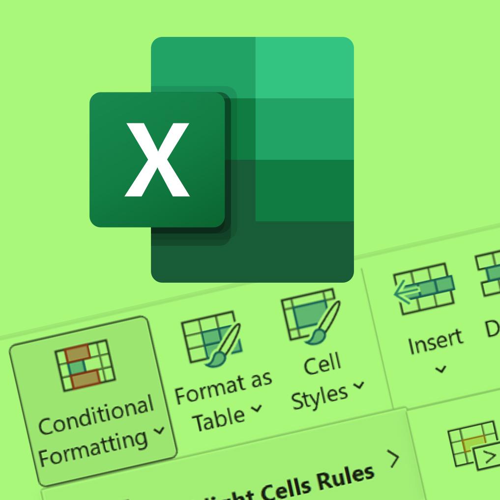
Excel is a powerful and versatile tool for managing and analysing data. But maybe you'd like to present it in a more attractive way? One of the simplest and most useful features for improving data presentation is conditional formatting. This feature allows you to visually highlight important information based on certain specified conditions. In this article, we'll explore different conditional formatting techniques to make your spreadsheets more informative and attractive.
Apply simple conditional formatting :

You can apply conditional formatting to a range of cells (a selection or a named range), an Excel spreadsheet and even a pivot table report. First select the range of cells you want to apply conditional formatting to. Conditional formatting can be found on the Home tab of the Ribbon, in the Styles group.
Excel provides predefined rules that you can easily apply to your data. For example, you can use conditional formatting to highlight cells with the highest or lowest values, highlight duplicate values, etc. You can also use conditional formatting to format cells that contain dates. For example, you can use the A Date Occurring rule to highlight future dates, or format weekends differently from weekdays.
Use data bars to fill the cell according to an objective:
Data bars can be used to graphically display the values in a series of cells in the form of coloured bars. You can use them as a progress bar to fill the cell according to a specific goal, which can be very useful for visualising progress towards a goal or target. For example, if you have a sales or customer target for each month, you can use the data bars to view your results against the target.

Here's how to use the data bars to fill the cell according to a target:
-
Select the range of cells containing the values you want to graph.
-
Click 'Conditional Formatting' on the 'Home' tab of the ribbon, then select 'Data bars' from the drop down menu.
-
In the submenu you will see several options for predefined data bars. Select 'More Rules...' to customise the data bars to your preferences.
-
In the Edit Formatting Rule dialogue box, use the Minimum and Maximum options to define the minimum and maximum value range for the data bars. You can select a different type for the 'Minimum' and 'Maximum' values. For example, you can select a number for 'Minimum' and a percentage for 'Maximum'.
-
To format negative bars, click on 'Negative value and axis...', then in the dialogue box select the fill and border colour options for the negative bar. This allows you to shape the bar so that it starts in the middle of the cell and extends to the left for negative values.
Using the data bars in this way gives you a quick, visual overview of your progress towards a specific goal. This makes it easier to analyse performance and make informed decisions about achieving your goals.
Value-based icons:
Another interesting way to improve the presentation of your data is to use value-based icons. Excel provides sets of icons to represent indicators, such as up or down arrows, red or green flags, and so on. These icons can be applied according to rules you define, as described above for data.
Create custom rules:
For more specific formatting, you can create your own custom rules. From the Conditional Formatting menu, click New Rule... and select Use a formula to determine which cells to format. Here you can enter a formula that defines the condition that will be used to format the cells. Ideally this formula should be written for the 1st cell in the selection. For example, to highlight values above a certain limit, you could use the formula "=A1>100" (if you want to highlight values above 100 in the selected range starting from A1). This formula can contain any Excel function.
Formatting an entire row:
In addition to the conditional formatting of individual cells, Excel also allows you to format an entire row according to a specific value. To do this, you need to create a custom rule and enter the appropriate formula: the "trick" is to make good use of absolute references, the famous $, in the formula you enter, as this formula applies to every cell in the selection. For example, to highlight the row for the month selected at B3 in the range starting at B8 (the values in the cells of type Month/Year contain the date of the 1st of the month, with a format that displays only the month and year), you can use the formula "=$B8=$B$3" (each cell in a row will therefore refer to the date contained in column B and evaluate whether it is equal to the date contained in B3).

Unfortunately, it is not possible to apply conditional formatting directly to a shape or graphic object in Excel. Conditional formatting is a cell-specific feature and does not apply directly to shapes.
However, there are other ways to achieve similar results using design tricks in Excel. Here's one way to get a shape with conditionally formatted content:

-
Create a cell using conditional formatting: First, apply conditional formatting to a cell according to your specific criteria. For example, you can use fill colours or icons depending on the value of the cell.
-
Copy the cell: Right-click the cell you have conditionally formatted and choose Copy.
-
Paste an image from the cell into a shape: Select the shape or graphic object into which you want to paste the conditionally formatted content. To paste the image from the cell into the shape, you will need to use a 'special paste'. Select 'Image' as the paste format and tick the 'Link' option to link the shape to the original cell.
By linking the shape to the original cell using conditional formatting, any change in the cell value is automatically reflected in the shape. This allows you to simulate a shape with conditionally formatted content.
Note that this method may not be as flexible or dynamic as conditional formatting applied directly to cells, but it can be an interesting alternative for creating visual representations with custom shapes based on specific conditions.

In summary, conditional formatting is a powerful tool for improving the presentation of your data in Excel. By using predefined and custom rules, adding data bars and icons, formatting rows and applying conditional formatting to shapes, you can make your spreadsheets clearer, more informative and aesthetically pleasing.
Take the time to explore these different techniques to take full advantage of this functionality and make your data analysis more effective and visually appealing.
Use Quick Analysis to apply conditional formatting even faster!
Use Quick Analysis (or the shortcut 'Ctrl+Q') to make Excel offer you conditional formatting based on the data you've selected. The Quick Analysis button appears automatically when you select data.
-
The formatting options that appear depend on the data you have selected. If the selection contains only numbers or text and numbers, the options are Data bars, Colours, Icon sets, Top, Top 10% and Clear. If your selection contains only text, the options are Text, Duplicate, Unique, Equal to and Clear.
Maybe
you'll like…