Although Word, in its many incarnations is probably the tool of choice to create a wide range of documents, graphic designers never took it seriously. One of the major drawbacks being the lack of features to handle fonts and to produce typographically acceptable publications.

Some new features and the support of OpenType have changed this. However, no one seems to be aware of these functions, not the least because in Word none of these great features is set as a default. The reason being that text in older documents might start to shift when opened in a recent version of Word due to the use of the OpenType features.

Most of the features are accessible in the ‘Advanced’ tab of the Font dialog box.
Kerning
Kerning is a part of all professionally designed fonts. It defines the distance between each possible pair of glyphs (characters) in a font.
Why would we need this information? Without kerning, the space between every pair of characters in a word might look ‘optically’ different; although they are ‘mathematically’ the same. The cause of this are the different forms of the glyphs and the interaction between them.

As you can see, the space between the glyphs is equal with no kerning applied. When kerning is used, the space between the ‘W’ and the ‘o’ has become a ‘negative’ space; these two glyphs overlap slightly.
There is a limitation to kerning: below text size 8pts it is not visible anymore.
Does Word offer the same kerning controls you will find in professional apps like the Adobe suite of applications or Quark Express? No, in InDesign e.g. the designer is able to overrule the kerning pair information as defined in the font and make subtle changes to fit the overall design.
OpenType
What is OpenType and why should we use it? Let us have a short overview of the history of digital type, also known as ‘the war of fonts’.
In the beginning there was chaos; every application needed its own specific driver and its own specific collection of fonts for any single type of printer. This changed in 1984 when a number of technologies came together. The Apple Macintosh with its unique operating system allowing all applications running on it to use the same drivers and Adobe PostScript which enabled using one single driver to print to any PostScript-enabled printer. This also meant only one single set of fonts could be used. Of these, two different types existed: Type 1 fonts produced solely by Adobe and Type 3 fonts for which the technology was licensed to third-party font foundries.
Two companies did not really like the quasi-monopoly on PostScript fonts held by Adobe and decided to develop a competing printing technology. Apple and Microsoft brought together two technologies, TrueImage —a RIP or Raster Image Processor which never really saw the daylight— from Microsoft and TrueType —codename ‘bass’ because fish is scalable too— by Apple.
The major advantage of TrueType over PostScript fonts? TrueType uses the same data to paint the font on screen or to print it. However, TrueType quickly received a bad reputation, especially in professional graphical environments. One of the reasons was the quick proliferation of TrueType fonts, not all of the same quality. E.g. CorelDRAW, a vector based drawing application on Windows enabled any user to create his own fonts, based on drawings made in the application.
Both PostScript and TrueType fonts had a severe limitation; they could contain only up to a maximum of 256 glyphs (256=28).
Enter OpenType. OpenType is able to contain up to 65536 glyphs (65526=216). This allows OpenType not only to contain the basic Latin alphabet, but also all possible variations with all possible accents on all possible letters. Did you ever hear about the ogonek? This not an extinct animal but a diacritical mark used in Polish and included in OpenType: here is a capital A with an ogonek: ?.
Not just the Latin alphabet… Arabic, Hebrew, Greek and Coptic, Cyrillic, Chinese and more writing systems may be included in just one font. Symbols and dingbats too… And ligatures.
OpenType Features — Ligatures
Joining two or more letters in a single glyph results in a ligature. A commonly occurring ligature is the fi-ligature.

Other common ligatures are the ‘fl’, ‘ffi’, ‘ffl’ etc. And let us not forget the ligatures in common French words like œuf and cœur.
Which ligatures —if available in the font— will be used? Besides ‘None’, Word allows for four different settings:
|
Standard only |
This setting will enable all ‘standard’ ligatures like fi, ffi, ff, etc. |
|
Standard and Contextual |
This setting enables the standard ligatures plus some extra ones that will only appear in a specific context. E.g. the ‘ae’ combination will only turn into a ligature in a word where it is needed like ‘æsthetics’. |
|
Historical and Discretionary |
This setting may be a bit over the top. You might see ligatures like ‘ct’, ‘st’, and others show up. |
|
All |
All ligatures, standard, contextual, historical, and discretionary will be applied. |
OpenType Features — Number spacing
The default number glyphs in a font are mono-space: each one of them take exactly the same width. This is useful when putting a series of numbers in a list since the different decimal places are correctly aligned. This is, however, different from most fonts where all other glyphs have their own width, the ‘m’ being the widest, the ‘I’ being the thinnest glyph.
In regular text, ‘proportional’ should be the preferred setting, in tables or lists e.g. a pricelist, ‘tabular’ should be used.
OpenType Features — Number forms
The default number glyphs in a font all have the same height. Whenever a number is used as part of a text, e.g. a date, this will make the numbers stand out, not really being a part of the text.
Recommended settings for regular text: ‘old-style’ forms, combined with ‘proportional’ spacing.
OpenType Features — Stylistic sets
Some fonts may contain several stylistic sets offering different variations on the same font. Most fonts only contain one single set, theoretically a font may contain up to 20 sets. Gabriola, a default font that comes with Windows contains eight different sets.

OpenType Features — Contextual Alternates
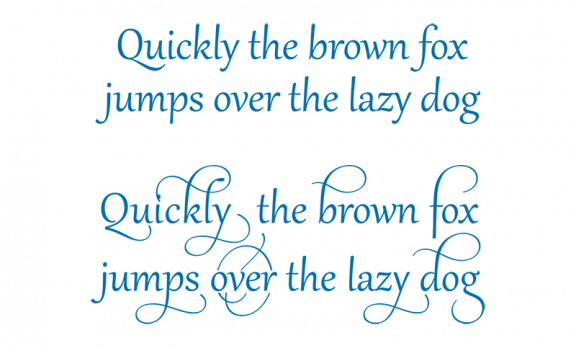
Some OpenType fonts contain contextual alternates. This means that for some glyphs alternate forms exist. These alternates will be used depending on the glyph that is used right after them.
We can easily recognise ‘handwritten’ typefaces as not being really handwritten but computer generated: each glyph always looks the same. Not so if contextual alternates are used. In the illustration below we can see 4 different forms of the ‘s’ in one single word. This makes the font look more natural, more ‘truly’ handwritten.

In general, also for other fonts, it is recommended to have the option for contextual alternates switched on.
Conclusion
MS Word has some features that enable the user to create professionally layout text. It is still far from the options available in professional design and layout applications like the Adobe suite or Quark Express and others, but at least it will not look amateurish.
It is a pity though that most options are switched off as a default, although this might be needed for backwards compatibility.
To go further
You may be interested in the following trainings
Maybe
you'll like…

 FR
FR EN
EN


